


Mebwood - when color emphasizes the oak massif, and furniture shapes the character of the space.
Color as an emotion and strategy of space
In 2026, color in furniture design finally goes beyond the decorative function. It becomes a tool for influencing the emotional state, behavior and perception of space. Interiors no longer strive for sterile universality - on the contrary, they seek character, warmth and individuality. That is why furniture and tables play a key role: their color forms the core of the interior.
Analyzing the leading design forecasts and the practice of furniture manufacturers, we can clearly distinguish several global trends that determine the color palette of 2026.
1. Earthy palette: the new luxury of naturalness
The most powerful trend of 2026 is earthy colors in all their manifestations. Terracotta, clay, ocher, umber, burnt brick, warm brown shades - these colors create a feeling of stability and "grounding".
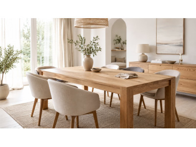
In tables, these tones are especially effective on solid wood. Oak, ash or walnut with warm tones look massive, status and at the same time cozy. Such tables are ideal for kitchens, dining rooms, meeting areas and restaurants, where an atmosphere of trust is important.
Practical advice: earthy colors work best in a matte finish (oil, wax, soft-touch varnish). Gloss in this palette reduces the depth of the color.
2. Warm neutrals of the new generation
Classic white and cold gray are losing their relevance. They are replaced by complex neutral shades: milky, cream, sand, linen, greige, khaki with a warm undertone.
For furniture and tables, this means versatility without "emptiness". These colors do not dominate, but create a background that emphasizes the shape, texture and material. They are especially relevant for modern interiors with minimalist architecture.
Designer tip: warm neutrals look much more expensive when combined with expressive wood or fabric textures (boucle, velor, natural linen).
3. Deep blues and indigo: intellectual elegance
In 2026, blue becomes a new alternative to black. Shades of indigo, night sky, deep ocean and graphite blue are actively used in tables and cabinet furniture.
These colors create a feeling of concentration, intellectual depth and peace. They are ideal for offices, home offices, conference rooms.
A successful combination: dark blue countertops or facades + accessories made of matte brass or bronze. This creates the effect of “quiet luxury” without excessive demonstrativeness.
4. Green palette: a balance between nature and technology
Green remains one of the key colors, but in 2026 it becomes more complex. On trend: olive, moss, sage, pistachio, as well as neo-mint with a slight technological undertone.
In tables, green most often appears in supports, suspended ceilings or combined elements. It goes well with natural oak and stone, creating a sense of harmony and relaxation.
Practical application: green is ideal for recreation areas, bedrooms, wellness spaces and modern kitchens.
5. Lavender and purple nuances: the color of mental comfort
Digital Lavender in 2026 evolves from a trendy accent to a stable basic shade. It symbolizes balance, calm and care for mental health.
In furniture, this color is most often used in soft elements, but it is increasingly appearing in designer tables as a delicate accent or toning.
Tip: Lavender works best in matte finishes and in combination with light wood or warm neutrals.
6. Metal and chrome: light as part of color
The return of the 70s aesthetic has brought a fashion for chrome and metal surfaces. In 2026, metal is not perceived as cold - it becomes a reflector of light and color.
Silver table legs, chrome frames, mirror inserts work as visual amplifiers of the interior palette.
Important: metal looks best in combination with warm wood colors or earthy shades - it is in the contrast that the design effect is born.
7. Texture as an extension of color
In 2026, color cannot be separated from texture:
· velor and velvet deepen dark and rich shades;
· matte surfaces make pastels more modern;
· the open texture of wood under colored varnish maintains a connection with nature.
It is the texture that makes the color “alive” and expensive.
Main principles of 2026
Color trends in furniture and tables in 2026 boil down to several key ideas:
· color has emotional meaning;
· naturalness is more important than ostentatious brightness;
· complex shades look more expensive than simple ones;
· individuality is valued more than compliance with patterns.
Main advice
When choosing the color of furniture or a table in 2026, focus not only on trends, but on the feeling: comfort, warmth, balance and character of the space. It is these interiors that remain relevant for years, not seasons.
The Mebwood brand creates tables and chairs from natural oak, where each shade is a continuation of nature, not just a trend.
P.S What shades will oak “dress” in 2
026 ?
Warm natural tones
Honey, caramel, light cognac oak is the basis of modern interiors. It is these shades that best reveal the massif and make Mebwood tables the center of the space.
Deep dark colors
Dark chocolate, burnt oak, walnut are the choice for status interiors, restaurants and meeting rooms. Dark-toned oak massif looks monumental and expensive.
Earthy palette 2026
Terracotta, clay, ocher are colors that go perfectly with natural wood. In combination with Mebwood oak tables, they create an atmosphere of warmth and stability.
Greenery and tranquility
Olive, moss, sage accents harmoniously complement oak chairs and table supports, emphasizing the connection with nature.
Mebwood is more than just color
✔ solid oak
✔ living wood texture
✔ natural oils and waxes
✔ individual tinting
✔ furniture that never goes out of style
In 2026, the trend is not to blindly follow colors, but to choose furniture with character. This is exactly what Mebwood tables and chairs are.
-192x200.jpg "Extendable YNWood table made of solid oak")


-400x300.jpeg)
Write a comment